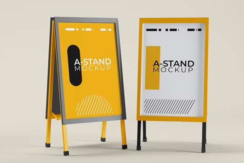
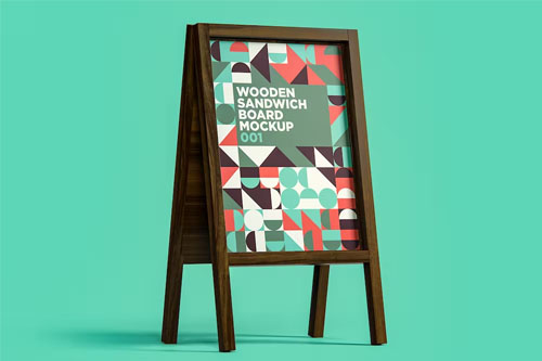
Sandwich Boards and A-Frames
A-frames and sidewalk signs are effective ways to direct passersby to your business. Usually, they sit outside businesses, often on sidewalks or near parking lots.
They are ideal for businesses because they can be easily moved from one location to another and can be changed frequently. This is especially useful if you want to promote specials and offers daily.
Where's the Sidewalk Sign?
- Fronts of stores
- Open Houses
- Roadsides
- Special Events
- Just Opened
- Today's Specials
- Using fun messages to entice customers
- Trade shows and indoor events
- Directional information to let customers know you're just around the corner
- Outside promotions and sales at stores, restaurants, and other establishments
How to Get Your Sign to Stand Out: Simple Tips
Contrast in your sign makes it lively, visible, and easy to read from a distance. The higher the contrast of your sign, the easier it is to see – thus, the easier it is to express your point to the people.
Color is one of the simplest ways to create contrast. High-contrast color choices, such as black on yellow or red on white, capture attention and boost readability, making your message more difficult to overlook.
Consider where you want your sign to go. Will it be installed in high-traffic areas, such as highways or popular shopping malls? If that is the case, you may need to use strong, eye-catching components to stand out from rival signage. If your sign is shown alone in a quieter environment, a simple design with conservative colors may suffice to convey your message (and save some money).
While fancy fonts are great for wedding invitations, they won’t make your sign stand out. Despite their attractiveness, frilly, decorative fonts are difficult to read and decipher. Even if it fits your brand image, it can muddle your message. Instead, choose crisp, clean, and powerful fonts when designing signage. With these fonts, your sign will stand out from the crowd and be easily read.
Your font style isn’t the only text-related chore you have to complete when developing a unique sign. You should also ensure that the individual letters on your sign are correctly sized for maximum visibility.
Consider how far your sign will need to be seen to do so. Experts recommend adding one inch of letter height for every 10 feet of distance. If you want your sign to be visible from up to 300 feet away, your lettering must be at least 30 inches tall.
Successful sign design must adhere to the golden rule of simplicity. You only have a few seconds to convey your message to the crowd. Therefore, the more simple and direct your sign, the easier it will be to read and understand quickly. Keep text short, impactful, and as concise as possible. Using more than two fonts can create confusion, so use only two fonts in one design.
From Start to Finish, We've Got You Covered
Printer World is more than just signs. By providing comprehensive, creative, and result-oriented services, we help increase our customers’ visibility. Hence, we offer services like content development, project management, graphic design, and more, along with graphic and visual solutions.

Printer World offer complete printing solutions from its Print Shop located in Edmonton Alberta.
We will print and ship anywhere!
We Accept
© Copyright 2023 – Printerworld – Designed By Linkbuffer Studios And Research Labs. All Rights Reserved.
Product Category
© Copyright 2023 – Printerworld – Designed By Linkbuffer Studios And Research Labs. All Rights Reserved.
Printer World offers complete printing solutions and printing services in Western Canada.
We Accept
Follow Us
Product Category
Subscribe Now
Don’t miss our future updates! Get Subscribed Today!
© Copyright 2023 – Printerworld – Designed By Linkbuffer Studios And Research Labs. All Rights Reserved.